

OPENMARKET Branding Refresh
With over 20 years in enterprise mobile messaging, OpenMarket’s brand was starting to feel out of sync with its modern flagship product, Indigo. They asked for a light refresh to bring the two into alignment. We refined the logo mark for more depth and updated the wordmark with a cleaner, contemporary typeface that better complements Indigo—creating a subtle, cohesive brand evolution.
UNIFYING BRAND COLORS
Starting with the original and current OpenMarket color family, the goal was to unify it with the color family of Indigo and to do this we explored small steps in that direction to achieve the desired effect.


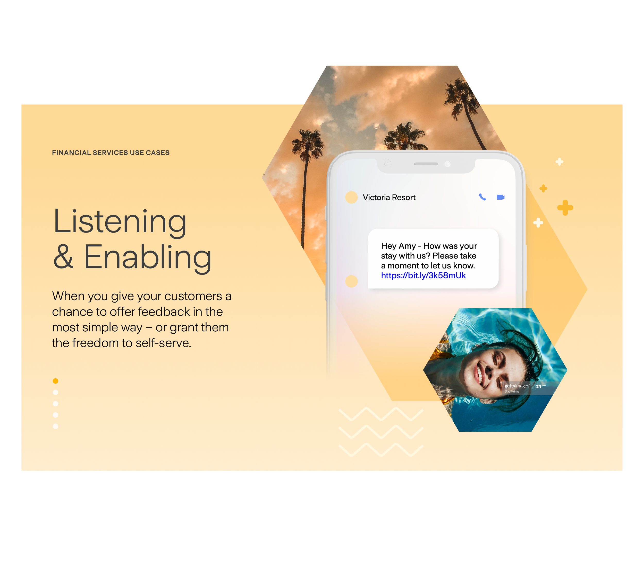
Website Component Designs
As we explored OpenMarket’s refreshed brand direction, we tested new website components—from updated color and graphic systems
to a modernized photography style—to bring the visual language forward.


APPEARING EVERYWHERE
With the new graphic language and patterns in place, we began applying them to illustrate the OpenMarket platform as a dynamic,
always-on tool—reaching customers anywhere, anytime, with the timely information that builds trust.