

REFRESH CX
A long-time leader in the contact center space, Five9 needed a refresh to show customers—and competitors—that they weren’t just an “old dog,” but still full of new tricks.
Their existing logo, tied to the cloud when that was cutting-edge, was starting to feel dated and top-heavy in applications.


COLOR FAMILY
In a competitive market, Five9 wanted to evolve their color palette to feel more sophisticated while keeping some connection to their established primary color.
They were struggling to balance the bold Magenta with other strong colors, so we explored a range of combinations and color volumes in layouts
until we found a harmonious solution that supports the primary and works for the brand moving forward.


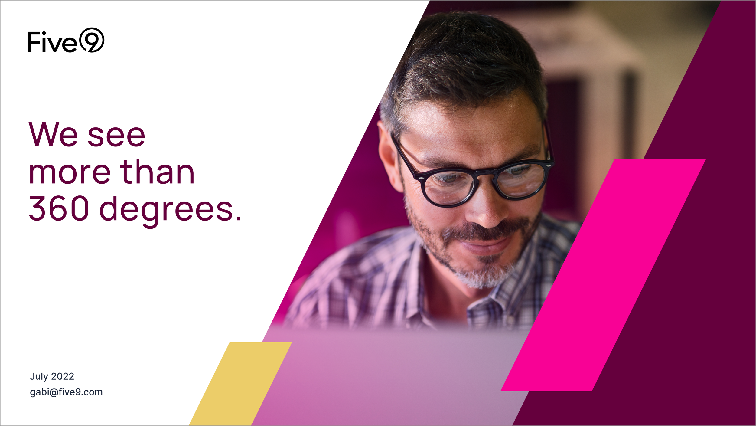
BRANDING APPLICATIONS
To explore the brand system’s full potential, our team created a variety of layouts that showcased voice and tone, patterns,
and photography styles—all designed to bring this visual direction to life.

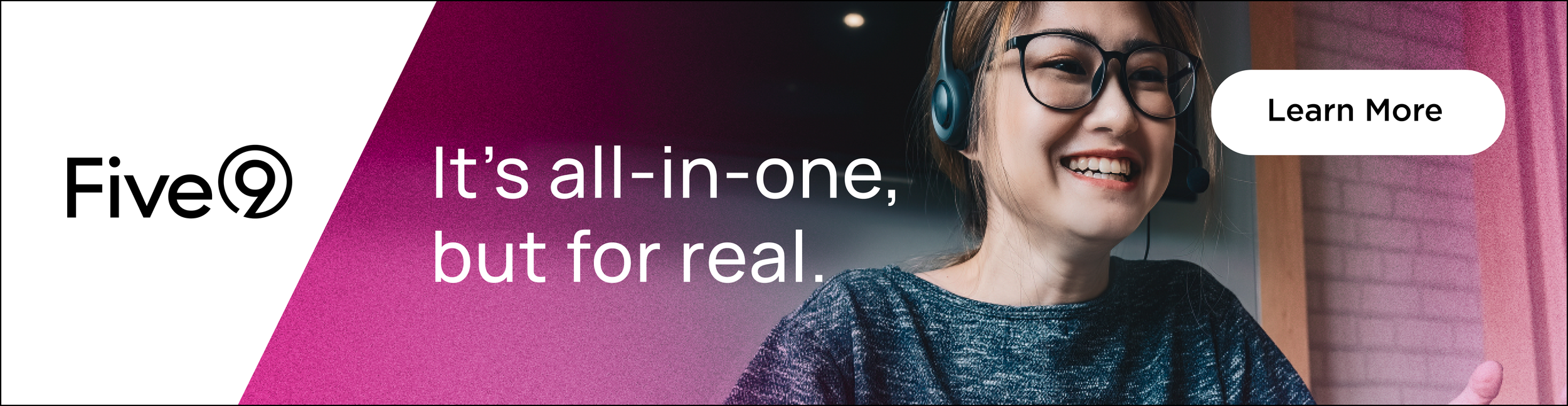
BANNERS and SOCIAL
The campaign positioned Five9 as a customer-centric, modern contact center leader. Through playful, relatable messaging and refreshed branding,
it highlighted the platform’s all-in-one capabilities and ability to anticipate customer needs, making complex solutions feel approachable and human.


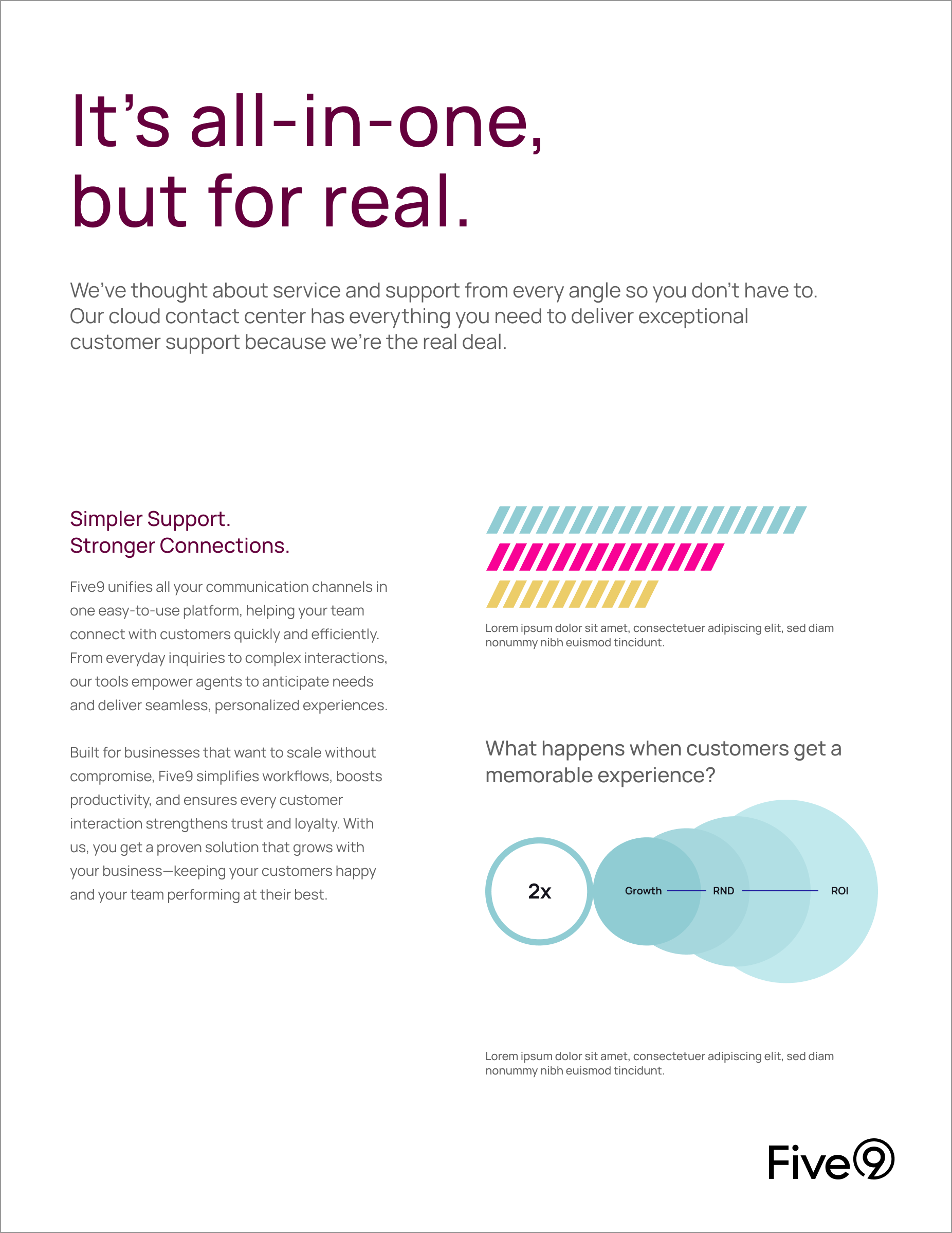
SIMPLICITY and STRENGTH
Five9’s visual system was designed to be simple, consistent, and versatile—working seamlessly across common applications while remaining compelling for sales and external use.


Front
Back

Tradeshow booth designs

Brand extensions for the roll out
